Making "Breaking Bad"
The Breaking Bad title slide is actually a pretty complicated design with a number of elements, including the periodic table cells, the smoke, and the somewhat hollow font. I thought I could probably do it all in Photoshop with enough effort, but I was hoping to get a head start.
There is someone who has created a typeface called "Heart Breaking Bad" in which the various glyphs are actually periodic table cells. I was thrilled. I started with that and put together a card mockup, and I was initially quite happy.
But there was a problem.

Do you see the problem? You're not obsessive, so you might not.
Compare that with this sample from a promo from the show.
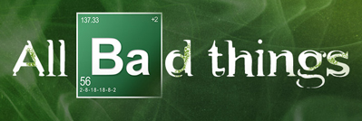
One obvious thing is that the table cell from the show has a gradient and shading and all that. But my issue is even more profound. This typeface which is explicitly constructed to mimic the design elements from the show actually gets it wrong! They have the various sub-elements (atomic number, valence, etc.) in the wrong place and they don't have all the details! So I had to bite the bullet and design the cells myself.