Making "15 Minutes"
But then I had a flash of inspiration. What if I produced a single image which combined the famous (and excellent) Warhol images of Marilyn Monroe and Andy Warhol with my own versions of Benjamin and Jeremy? The resulting composite ought to be evocative of the original Warhol theme but still incorporate Benjamin and Jeremy.
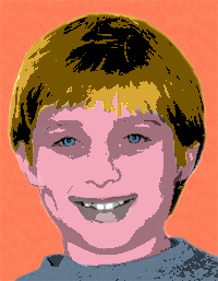
The more I played around with the idea, the more I liked it. The only problem was that, no matter how hard I tried, I couldn't produce a good "posterized" version of any photo of either child. All of them looked ugly. Finally I stumbled across a tutorial at Adobe's web site and I was able to tweak its advice enough to produce something that I was comfortable with. Below you can see the sequence of edits I used to produce the posterized version of Benjamin.


I chose colors that were complementary with the original Warhol colors and selected the predominant color to use as the primary font for the typography on the card. In addition, I selected a really cool font that I recently purchased from Adobe, which I think enhances the overall effect.
Interestingly, this card is semi-famous. Beth Teitell, a humor columnist for the Boston Globe, made reference to it in this column [editor's note: dead link].
If you liked this, or even if you didn't, please let me know.